
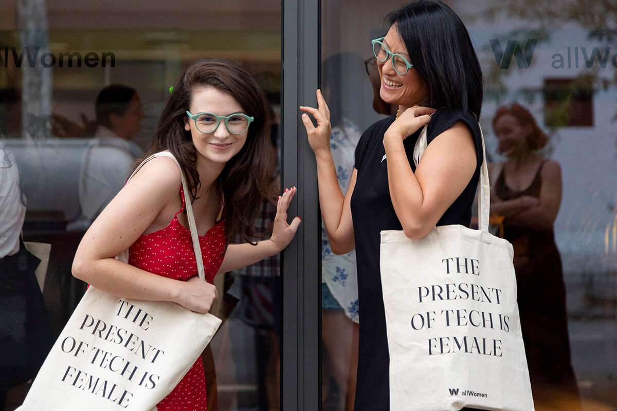
A website does not build a community.
Neither does a newsletter. Or a paid ad. Or a social post.
What builds a community is what happens when all of those things start reinforcing the same relationship.
That was the real scope of our work with allWomen.
The Barcelona-based tech academy already had a strong mission: creating learning opportunities and supportive spaces for women in technology. When we started working together, the business was expanding its course offering, rethinking its website and managing a growing community that would eventually pass 30,000 members.
The challenge was not simply to make the brand sound inspiring.
It was to turn that mission into a complete experience: something that could attract the right people, help them understand the courses, answer doubts, guide them towards enrolment and keep them connected to the community over time.
Our work stretched across UX strategy, competitor and audience research, wireframes, full website content, course syllabuses, blog articles, newsletters, nurturing emails, paid ads, social media and wider campaign content.
The breadth matters, but the more important point is what sat underneath it.
We were helping allWomen design the whole journey around the student, not a collection of disconnected marketing channels.
The new website started with the decision journey, not the copy
Education websites are deceptively complex.
A prospective student may arrive excited by the mission but still be unsure whether a programme is right for her, whether she has enough experience, how the course fits around work, what support is available or whether the investment will actually move her career forward.
Those are not small questions. They are the decision.
So we did not begin the allWomen redesign by filling pages with copy.
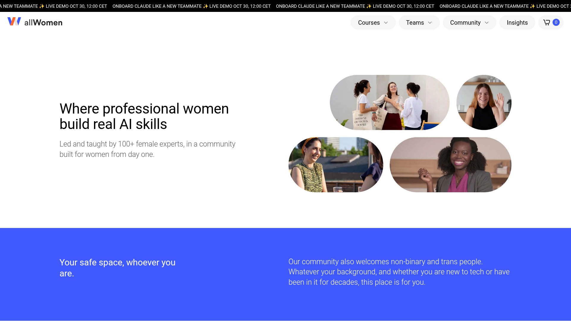
We worked on the UX strategy first: researching the competitive landscape, understanding the different types of learners allWomen needed to speak to, mapping the questions they were likely to have and shaping the structure of the site around those needs.
From there, we created the wireframes and developed the full website content.
That meant the information architecture, hierarchy, calls to action and language could evolve together. A page did not exist simply because the organisation had a department or a course to describe. It needed a clear role in the journey.
The resulting experience had to balance two things that are often separated unnecessarily: the emotional pull of the allWomen mission and the practical information someone needs before committing to a course.
The mission creates affinity.
The UX turns that affinity into confidence.
01 / Brand promise & website hierarchy
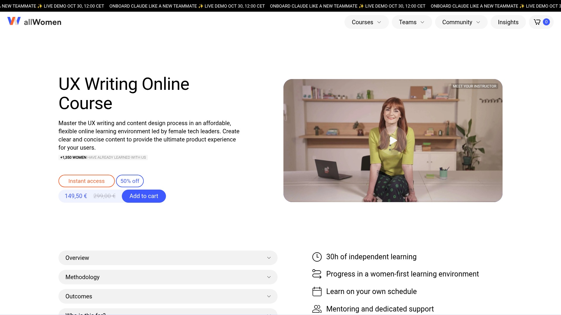
The syllabus was part of the conversion journey too
One of the most useful pieces of content in an education journey is also one of the easiest to treat as an afterthought.
The syllabus.
For someone seriously considering a course, the syllabus often sits at the exact point where general interest turns into detailed evaluation. It needs to show enough substance to make the programme feel credible, while remaining clear enough for someone to imagine the learning experience rather than simply scan a long curriculum.
We created the syllabuses as part of the wider student journey.
They had to extend the same positioning and tone as the website, but go deeper: what students would learn, how the programme progressed, what kind of projects or skills they could expect, and why that structure mattered.
That consistency is important.
If the website sells one version of the experience and the syllabus suddenly feels administrative, dense or disconnected, confidence drops at precisely the moment someone is looking for more proof.
Good conversion content does not always ask harder for the sale.
Sometimes it simply gives the right amount of information at the moment the reader is ready for it.
02 / Course content & decision-making
The work continued long after someone left the website
A better website only improves the experience for people who reach it.
allWomen also needed to keep attracting new audiences and remain relevant to people who were interested but not yet ready to enrol.
That is where the wider content and marketing work became essential.
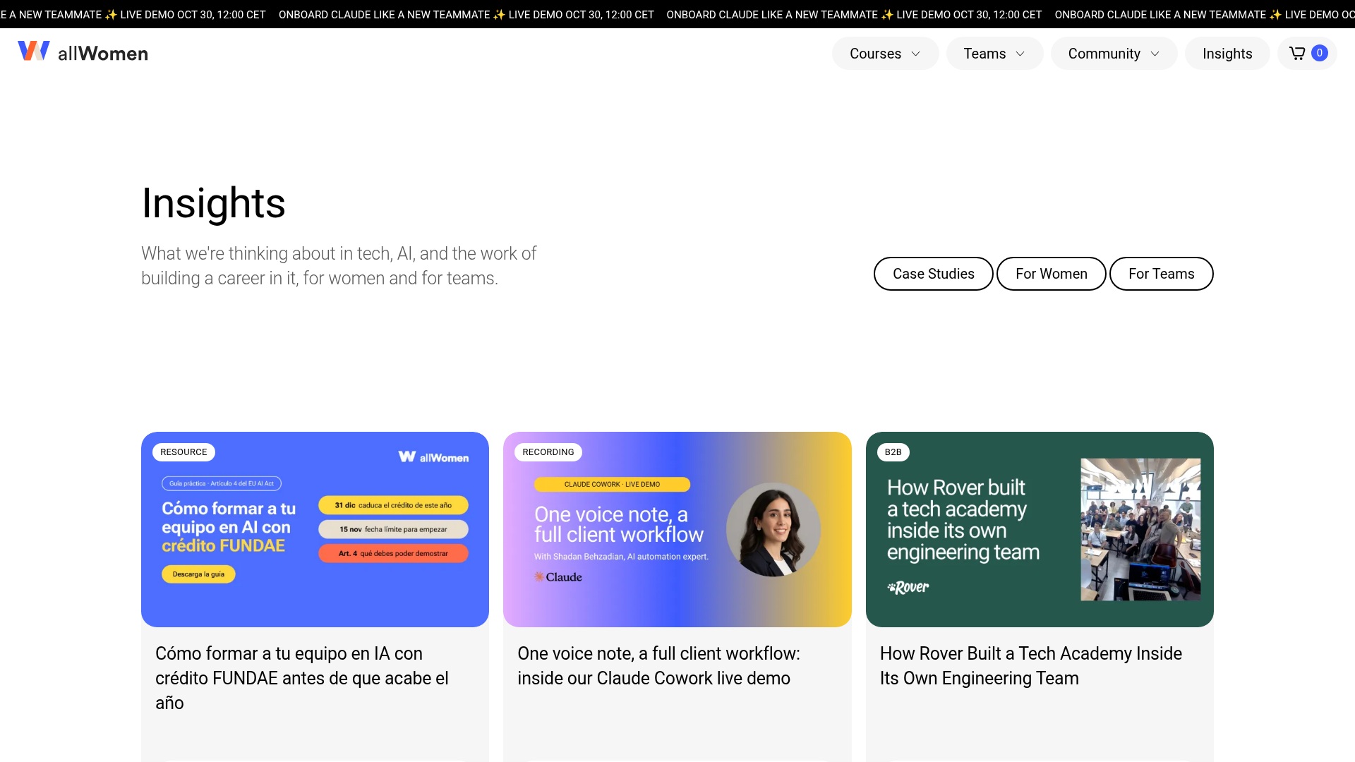
We wrote blog articles that could introduce ideas, answer questions and create useful entry points into the brand beyond the course pages themselves. We developed newsletters that kept the community engaged between moments of active consideration. We supported social media content that made the brand feel alive and visible, and paid campaigns that could put specific courses or opportunities in front of relevant audiences at the right moment.
Each channel had a different job.
The blog could build discovery and authority. Social could make the community visible. Paid could create focused reach. A newsletter could keep somebody close to the brand even when she was not actively shopping for a course.
The value came from treating those channels as parts of one relationship.
Someone who first discovered allWomen through a blog article might later see a social post, click a paid ad, explore a course page, download a syllabus and enter an email nurture sequence.
The brand should not have to reintroduce itself every time she moves to the next touchpoint.
03 / Editorial content & discovery
Email was where the long consideration cycle became visible
Education rarely follows a neat conversion path.
People research. They compare. They hesitate. Timing changes. Confidence changes. A programme can feel right long before someone is ready to enrol.
That made email much more than a promotional channel.
We worked across newsletters, course launches and nurturing journeys, using different messages to answer different needs at different stages of interest.
Some emails introduced an opportunity. Others answered practical questions, provided more reassurance or invited a more personal next step such as a consultation. Selected incentives and discounts could be useful, but only when they appeared inside a journey that already made sense.
The historical performance figures from the project were strong: an average open rate of 41%, an average click-through rate of 4.4%, a 21.4% CTR for the strongest-performing newsletter and an unsubscribe rate of just 0.7%.
Those numbers belong to the wider marketing effort and should not be attributed to copy alone.
What they do show is that the audience was engaging with the relationship rather than simply receiving more messages.
Community growth came from giving people reasons to stay
allWomen’s mission made community central to the brand.
But a community cannot be built through the word “community”.
People need reasons to remain connected when they are not buying anything.
That is why the content around the courses mattered just as much as the conversion content: blog articles that were genuinely useful, social content that reflected the people and ideas around the academy, newsletters that carried value beyond a promotion, and a tone of voice that made the brand feel supportive without becoming vague or overly sentimental.
During our collaboration, the allWomen community grew significantly, reaching more than 30,000 members.
That growth came from the wider allWomen ecosystem and the work of the internal team alongside partners like Bobs, not from any single campaign.
But it reflects the kind of relationship we were helping the brand build.
A person did not have to be ready to enrol in order for allWomen to be relevant to her.
That is a very different growth model from treating every piece of content as a direct-response asset.
Full service meant seeing the same person across every channel
By this point, our work covered UX strategy, wireframes, website content, syllabuses, blog articles, newsletters, nurturing journeys, paid campaigns and social media.
On paper, that is a list of deliverables.
The strategic value was continuity.
The same audience understanding could inform the website structure, the syllabus, the ads and the email journey. Questions appearing repeatedly in nurture could reveal something the course page needed to explain better. Social could express the same brand personality without copying the website. Paid messages could be sharper because the positioning had already been clarified elsewhere.
That is where Bobs added more than production capacity.
We could see the relationships between the touchpoints.
The audience does not experience UX, CRM, paid media, social and editorial as separate disciplines. She experiences a sequence of interactions with one brand.
If those interactions understand one another, the journey feels coherent.
If they do not, even a strong mission starts to lose force at every handover.
A strong mission creates interest. A strong system turns it into momentum.
allWomen already had something many businesses spend years trying to invent: a meaningful reason for people to care.
Our role was to help that reason survive contact with the real customer journey.
That meant thinking about the website as UX rather than pages. Treating syllabuses as decision content rather than attachments. Using blog, social and newsletters to build relevance before conversion. Designing nurture around the way people actually consider education. Supporting paid activity without disconnecting it from the brand. And making sure the same tone, logic and understanding of the audience travelled across all of it.
The result was not one perfect campaign.
It was a stronger system around the business.
One that could attract people, help them make sense of the offer, keep them engaged and give the community more room to grow.
That is the part of the allWomen project that best represents Bobs’ value.
We were not simply marketing courses.
We were helping design the experience around them.
Written by Bobs Agency
Talk it through with Bobs